Modern Brush Lettering or Traditional Calligraphy?
Nearly every enquiry mentions one of two things: proper calligraphy, or that lovely modern brushy style. They are genuinely different crafts rather than two names for the same thing, and knowing which you want makes the whole commission easier.
Traditional pointed pen calligraphy
A flexible nib on a wooden holder, dipped in ink. Pressure on the downstroke spreads the nib and makes a thick line, and releasing it on the upstroke gives a hairline. The contrast between the two is what your eye reads as elegance.
It is disciplined work. Letters sit on a ruled slant, the spacing follows established rules and the whole alphabet is built from a small number of repeated strokes. That consistency is exactly why it suits formal invitations, hand addressed envelopes and anything that should feel timeless rather than current.
Modern brush lettering
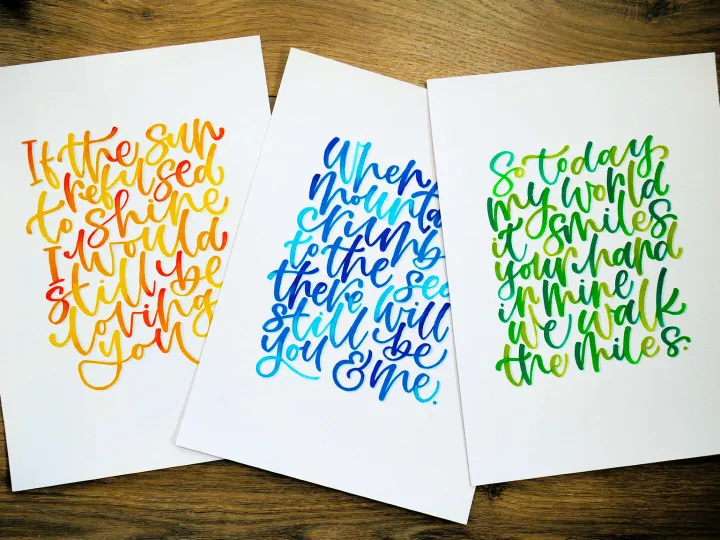
A brush pen or a pointed brush loaded with ink or paint. The same thick and thin logic applies, but the rules are looser: baselines bounce, letters lean into each other and the flourishes go where the composition wants them rather than where tradition says.
It reads as warm, current and personal, which is why it works so well on greeting cards, playful signage, window signs and murals. It also scales up far better. A brush stroke enlarged to a metre still looks like a brush stroke, where a delicate pointed pen hairline enlarged to a metre simply looks thin.
How to choose
- Formal wedding, classic venue, black tie usually points to pointed pen
- Relaxed celebration, colour, personality usually points to brush lettering
- Small and detailed favours pointed pen; large and seen from a distance favours brush
- A business that wants warmth almost always suits brush lettering
- Anything painted on a wall will be brush based, whatever the reference image looks like
You can have both
Some of my favourite pieces mix them: a name in loose brush lettering as the hero, with the details underneath in tidy pointed pen. The contrast gives the eye somewhere to land first and somewhere to go next, which is most of what good lettering does.
What to send me
Do not worry about naming the style. Send two or three images of lettering you like, tell me what the piece is for, and I will tell you what you are actually looking at and whether it will work at the size you need.
Style is only half of the decision. Colour changes the mood of a piece at least as much, often more, so the two are usually worth settling together. For weddings in particular, both run through everything from the invitations to the seating plan.
See both styles in the portfolio Ask which suits your project
Let's create something impossible to ignore.
Have a project in mind?
Tell me what you are dreaming up and I will come back with ideas, timings and a price.
Handlettered by Naomi
Bespoke hand lettering, modern calligraphy and hand painted murals.
Every piece drawn and painted by hand.
Get in touch
hello@handletteredbynaomi.co.uk
07909 922084
Instagram
Serving Shropshire, Staffordshire and Cheshire.