How Colour Changes the Way Lettering Feels
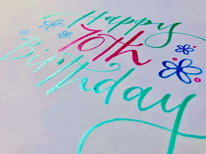
Write the same three words in charcoal grey on cream, then in hot pink on white, and you have written two different sentences. People read the colour before they read the letters, which makes the palette one of the first decisions rather than a finishing touch.
Contrast decides legibility, not colour
The most common palette mistake is choosing two colours that are lovely together and almost identical in tone. A dusky rose on a warm blush looks beautiful on a screen and disappears across a room. Squinting at a design is a surprisingly reliable test: if the lettering vanishes when you blur your eyes, it will vanish at a distance too.
This matters most on signage and murals, where the viewing distance does the blurring for you.
Paper is a colour
Cream, ivory, white, kraft and handmade cotton papers all shift ink noticeably. The same navy reads cool and formal on brilliant white and softer, almost antique, on cream. Textured papers also break up a stroke edge, which flatters loose brush lettering and can fight fine pointed pen work.
Metallics behave differently
Gold, silver and copper are not colours so much as surfaces. They change completely with the angle of the light, which is why they photograph badly and look wonderful in the hand. They are perfect for anniversary pieces and place cards guests pick up, and less reliable for anything that has to be read from across a room in flat light.
Building a palette that holds together
For most commissions three colours is plenty: one that carries the main lettering, one supporting tone for detail, and one accent used sparingly. If the accent appears more than a few times it stops being an accent and starts being a third main colour, and the piece loses its focus.
For weddings I usually work from something physical rather than a swatch on a screen. A ribbon, a flower, a piece of the fabric. Screens lie about colour; a real object does not.
Colour and mood in practice
- Deep ink on cream reads classic and calm, and never dates
- Bright saturated colour reads joyful and current, and suits celebration pieces
- One strong colour on white reads confident and modern, and works hard for brands
- Soft tone on tone reads gentle but must be checked at real viewing distance
If you already know the feeling you want but not the colours, describe the feeling. Working backwards from that is usually quicker than working forwards from a chart.
Lettering style and colour pull on each other, too. A heavy brush stroke carries far more pigment than a pointed pen hairline, so the same ink can read as bold in one style and barely there in the other.
Let's create something impossible to ignore.
Have a project in mind?
Tell me what you are dreaming up and I will come back with ideas, timings and a price.
Handlettered by Naomi
Bespoke hand lettering, modern calligraphy and hand painted murals.
Every piece drawn and painted by hand.
Get in touch
hello@handletteredbynaomi.co.uk
07909 922084
Instagram
Serving Shropshire, Staffordshire and Cheshire.